
Enhancing Bulk Assignment Emails
Trainual’s Bulk assignment email notifications were underperforming. Users found them unhelpful, cluttered, and inconsistent. To improve engagement, we needed to evaluate the existing experience and identify pain points.

Step 1: Discovery
Objective & Key Results (OKRs)
Primary Goal:
Increase the utility of the product
Key Results:
Boost 6-12 month Monthly Active Accounts (MAA) engagement by 30%
Increase non-admin/billing admin activity by 30% month over month
Understanding the Problem
Bulk assignment email notifications were underperforming. Users found them unhelpful, cluttered, and inconsistent. To improve engagement, we needed to evaluate the existing experience and identify pain points.
Current Experience: Strengths & Weaknesses
What’s working well? Emails are sent at the right time, ensuring users receive notifications when they need them.
Challenges & Areas for Improvement
Accessibility Issues: Text is too small, making readability difficult.
Loss of Trust: Inconsistent design and layout reduce credibility, making emails appear like spam.
Notification Fatigue: Too many redundant notifications overwhelm users.
Lack of Value: Emails provide insufficient helpful information, leading to disengagement.
User Confusion: Unclear whether reminders pertain to a single task or multiple tasks.
Misleading CTAs: Call-to-action buttons lead to unexpected or inconsistent destinations.

Are these emails helpful?

More emails
Defining the User Experience
To craft a meaningful solution, we explored the users’ needs:
Who are our customers?
What do they feel, think, say, and do?
What obstacles prevent them from achieving their goals?
User Persona: "Jen the General User"
The largest pain points were identified through user feedback and testing, allowing us to frame our approach using the How Might We methodology.

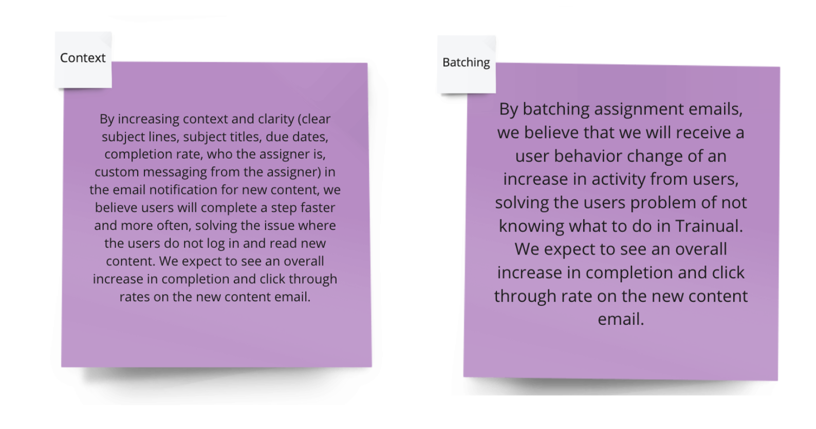
Hypothesis Framework and Testing:
We created two hypotheses to align on the expected impact of the design changes for our users and our business goals, helping us focus on key areas to test and make data-driven decisions.
By implementing [specific design changes], we believe [user behavior] will improve, addressing [identified problem]. We expect to see [measurable impact].
Competitive Analysis
We examined best practices in product email design, studying:
Color schemes
Dark mode compatibility
Mobile responsiveness
Iconography
Tone of voice
Gamification techniques


Step 2: Design, Test, Iterate
Iterative Design Approach
Concept Development: Brainstorming and wireframing solutions.
Prototyping & User Testing: Refining designs based on feedback.
Design Critique: Gathering insights from stakeholders and cross-functional teams.
Continuous Iteration: Enhancing usability and engagement metrics.
See our design and test plan below

Final Implementation & Launch
Once refined, the new bulk assignment emails were deployed. Key areas of focus included:
Improved readability and accessibility
A cleaner, more consistent design to build user trust
Reduction of redundant notifications
Clearer call-to-action links aligned with user expectations

Impact & Results
Post-launch analysis revealed positive trends:
Increased engagement among both general users and admins.
Higher Trainual logins and subject completion rates.
Improved in-app activity, reinforcing the effectiveness of the redesign.
We exceeded our goal of increasing click rates by 30%, which in turn increased training completions.
Key Learnings
Email Design Complexity: Ensuring consistency across devices requires extensive testing.
Dark Mode Considerations: Designing for different themes presents unique challenges.
Tracking & Measurement: Measuring engagement within emails and subsequent user actions requires robust tracking mechanisms.
Future of Email Notifications: With evolving user behaviors, alternative notification strategies may become more effective.
Next Steps
Continue monitoring engagement and iterating based on user feedback.
Explore advanced personalization techniques to enhance relevance.
Assess potential automation and AI-driven improvements for smarter notifications.